Last updated on August 21st, 2020 at 06:08 pm

An interview with Matt Haff of MattHaff.com
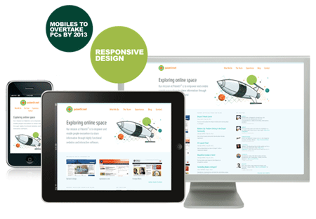
What is responsive web design?
Simply put, responsive web design is a website that responds to the size of the browser screen.
So does this mean you no longer need a separate site for mobile browsers?
Yes and no, for the majority of websites a separate site isn’t needed because a responsive website would be able to adjust to fit the size of your screen no matter what device you are using. The only reason to still have a mobile site is if you were treating your mobile site as more of a mobile app with very limited and specific information on it.
What’s involved to change a regular site designed for computer browsers into a responsive website?
The site has to be built with the latest standards preferably html5 and css3. Then it’s just a matter of having some code in the HTML & CSS that looks for the screen size. Then you can target specific screen sizes with CSS to reposition, resize, even hide certain elements based on the size of the browser.
On average how many different screen sizes should be targeted?
I target 6 different sizes, and it works for everything in between. Usually there are two sizes for a mobile phone vertical and horizontal. Two sizes for tablet, vertical and horizontal. Then a couple sizes for desktop browsers.
What type of businesses tend to get the most out of a repsonsive web design?
Just about any business can get good ROI on a responsive website. Mobile devices have already passed desktop devices for browsing the web, so anyone that is still just targeting desktop devices is loosing out on business. I think the stat was by 2014 the mobile share for online browsing was going to be around 80%.
I agree, but iPad and iPhone devices already browse the web effectively without the need for responsive design. What devices need responsive design?
They may not necessarily “need” responsive design but it makes a huge difference when a site is designed with the mobile devices in mind vs. just loading their regular site. People on a tablet or smart phone are browsing your site for a different purpose than someone on their desktop. They have different functionality, even something as simple as navigation can be drastically different on mobile devices. Think about using a mouse to navigate and click on a site vs. swiping and tapping with your finger, the spacing between elements has to be wider so users can actually click on stuff.
The other side to that is mobile users have to zoom in and push the site around in order to read the text. Having a responsive website can and should increase the font size, decrease the width of paragraphs so it’s easier to read, etc. Most smart phones and tablets can render a website in it’s natural state, it doesn’t mean that they should have to. What about devices that haven’t yet been invented, or new browsers coming out such as the fridge that has a built in tablet or the cars now that have a web browser installed? By having a responsive website it doesn’t matter what device you are on: phone, tablet, gps, game console, fridge, etc. It just works.
Well said. Is there anything else you’d like to add?
The last thing is no matter what you should spend time researching the end users needs. Not everyone needs a mobile app or responsive website, however if it does make sense then go for it.
8 replies to "Responsive Web Design: A Fundamental Shift In Design"
Great overview of rwd. Good to see you’re targeting more than just the 3 widths that seem to becoming the norm.
Though my site is just a blog, I’ve been thinking about doing something to develop a design for mobile. I am going to start looking more into this, especially since it seems mobile is getting more and more of the browsing.
Thanks for sharing!
I’m pretty excited as we’re redesigning clickfire with responsive design. No more mobile plugins.
Finally Google is on board with the concept and even officially recommends it now.
I’m so excited about rwd I may go out and get me a smartphone 🙂
You really do need to upgrade that thing, Tom 🙂
I’m trying to make my blog width fluid. But unfortunately not getting success. 🙁
Rudraksh, Matt can definitely help you with that.
I can’t make my website responsive because I don’t know how to make my website’s background image responsive too. 🙁
any advise? thanks